

Music Streaming Desktop App Layout — Redesigning the Sidebar Experience
Project Context
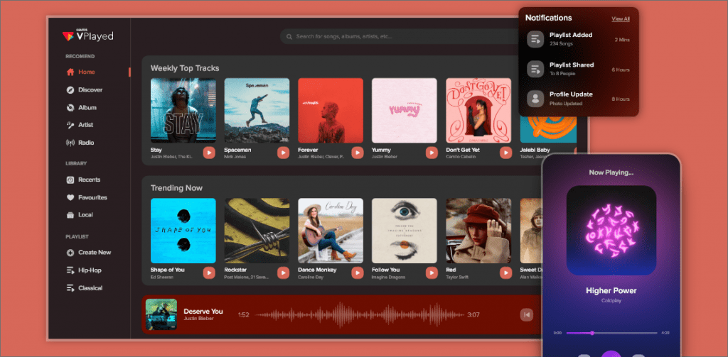
I love Spotify, but I feel like the desktop client has become incredibly cluttered with too many competing tabs (Home, Search, Your Library, Playlists, Podcasts). I designed a high-fidelity prototype in Figma focusing on a collapsible, icon-only sidebar navigation that expands on hover. The main content pane adapts dynamically using a card-based grid layout.
Feedback Requested
1. Hover State Interaction: Does a collapsible sidebar navigation feel clean, or do you think users will find it frustrating to hover over it just to find their favorite playlist? 2. Album Art Contrast: I used a dynamic color-sampling feature where the background gradient matches the album art of the currently playing track. Does this hurt text readability? 3. Desktop Real Estate: On wider screens (1440p+), the right side of the screen feels slightly empty. What utility component should I add there without cluttering the UI?
Critique Feed Thread